THE CHALLENGE: Develop a logo and identity system for FitBites, a new line of performance CBD-based products for athletes. Look should feel clean, modern, and cool — like a boutique brand. Also needed to design a coordinating infographic that explains how the three key ingredients work together to achieve optimal performance.
THE SOLUTION: The final design, titled "Power Up!", conveys action by evoking a power button and upward mobility with the central arrow that replaces the "I." The thicker "fit" could be combined with other product names beyond "bites" for future expansion. Limited the limited palette aids in visual cohesiveness as does the use of thick/thin condensed typography. Overall this design feels clean and modern without feeling trendy.
Scroll for a quick view or click on a graphic for a closer look.
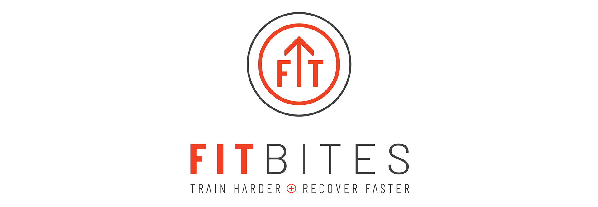
Primary logo
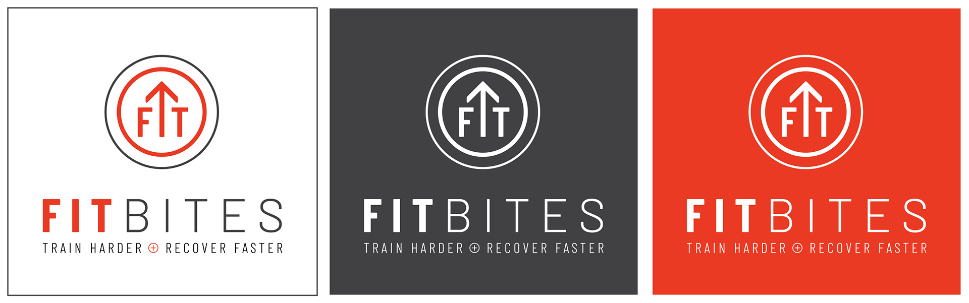
Other logo color variations

Alternate horizontal logo
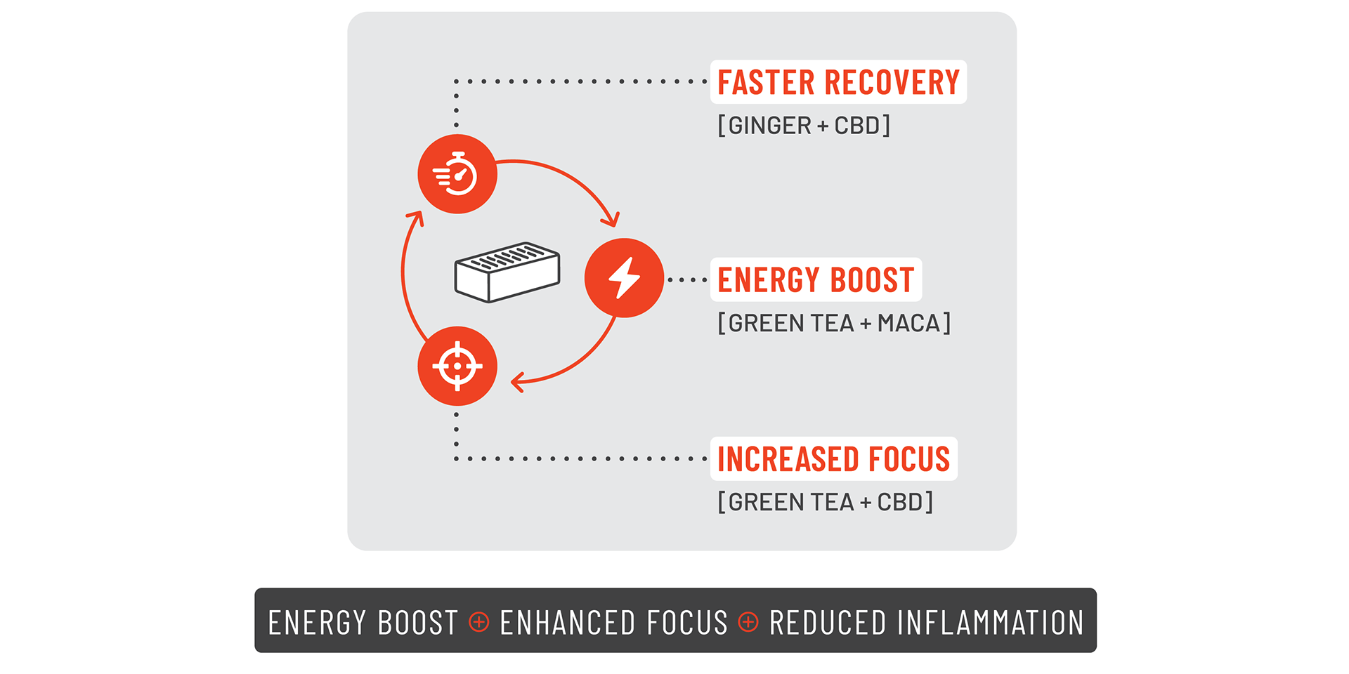
Infographic / Supporting message
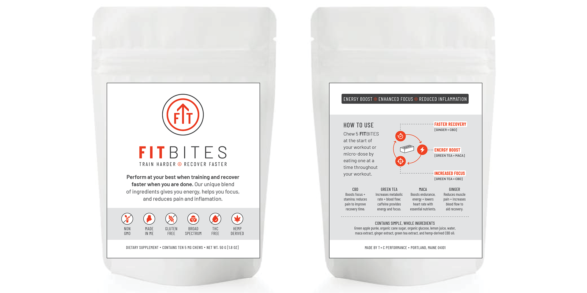
Packaging
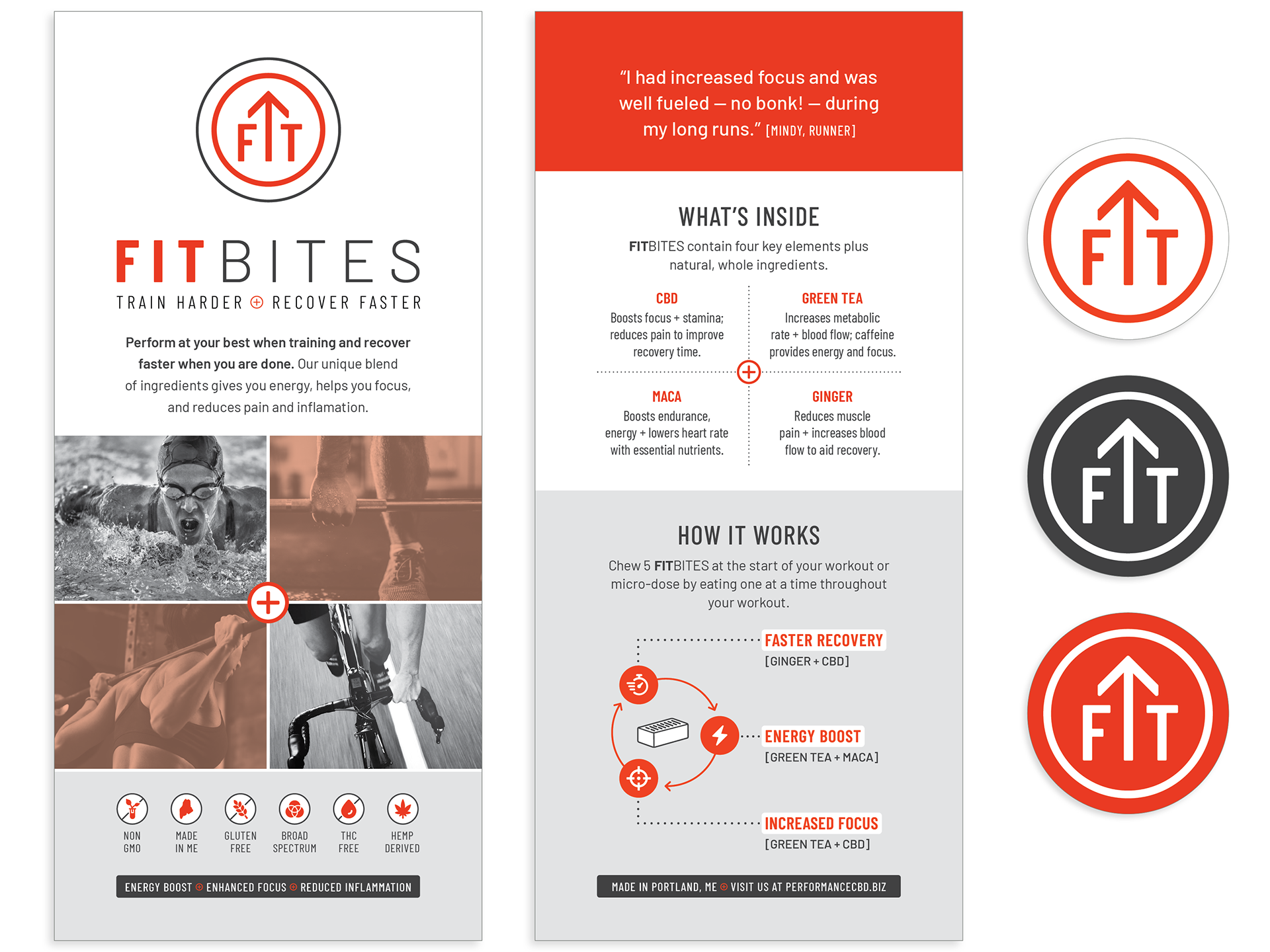
Rack card / Stickers