THE CHALLENGE: The Nature Conservancy in Maine wanted to promote a new campaign called "Nature is ME" to encourage statewide awareness about the environment and The Nature Conservancy in Maine. The campaign needed a logo, print ads, and a special newspaper insert. The materials should feel vibrant and current, use client palette, and include lots of natural textures and layers and type styles.
THE SOLUTION: The logo was inspired by scout patches and included three different typefaces to make it seem more "handcrafted." It also had a more dimensional version. Lots of wood textures and the illusion of paper placed on top of each other complimented the rough wood-print style headlines. Through these design elements, the campaign felt cohesive and the materials stood out in the media and was a huge success.
Scroll for a quick view or click on a graphic for a closer look.
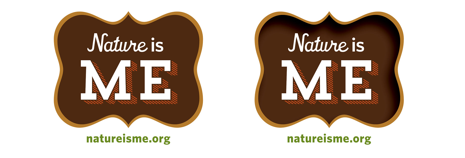
Campaign logos
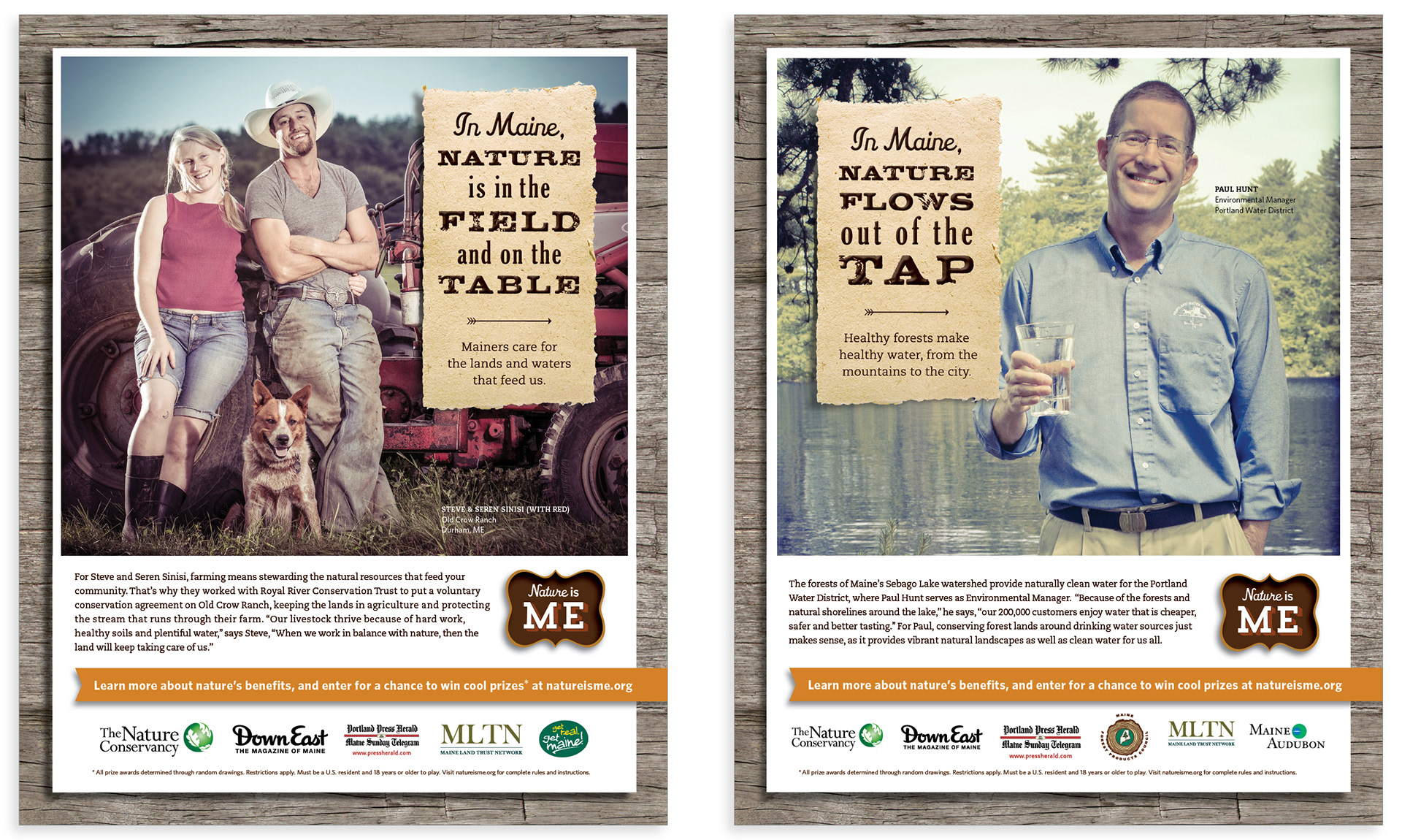
Print ads
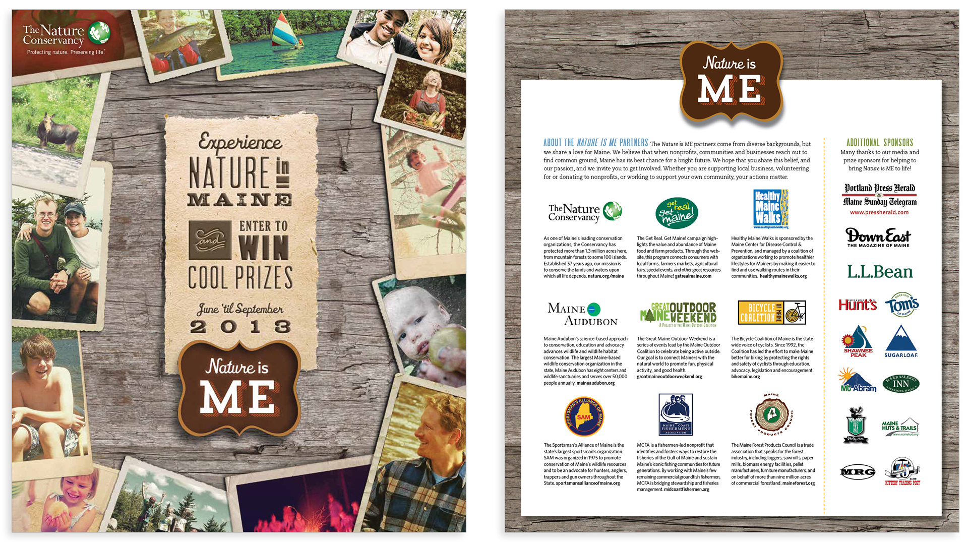
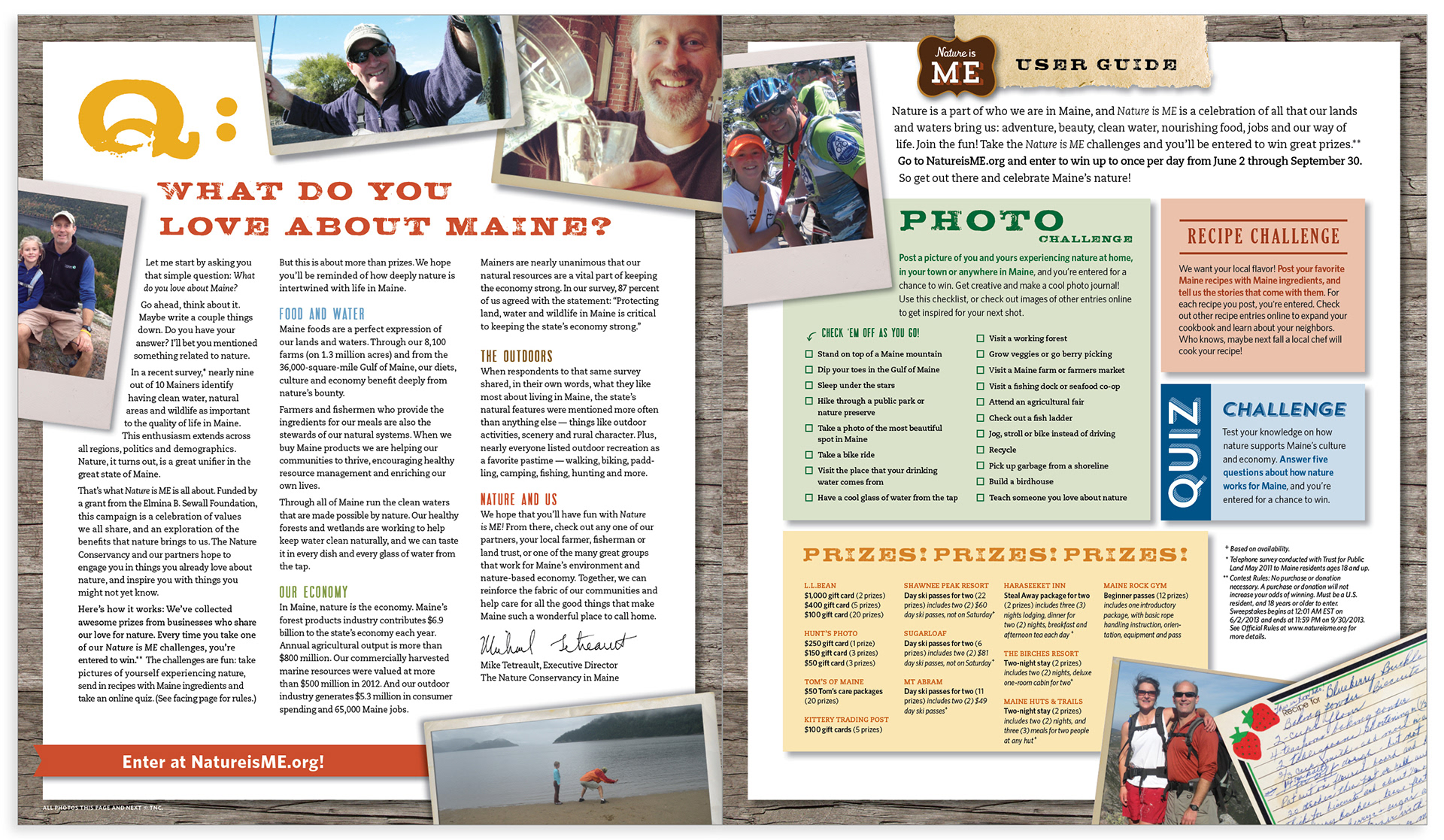
Newspaper insert
These projects were created in collaboration with McCabe, Duval + Associates.