THE CHALLENGE: Sage Cohen had been wearing lots of hats for years — she was a commercial writer as well as a published poet and had recently been teaching with her own curriculum for creative writing and living with divorce. She needed a logo system to represent all her hats while still feeling uniquely hers. This system should feel welcoming, exuberant, and creative — just like Sage herself!
THE SOLUTION: Sage's own handwriting was the inspiration for her very personal logo mark! Her signature letterforms combined with friendly sans serif typeface made a bold and unique statement. Each of her hats — we called them focus areas now — was represented with a different color for easy categorization. Playful graphics and patterns were developed to be integrated across future materials, many of which derived from drawings from Sage. The final identity has lasted years and continues to grow with the Sage Cohen brand to this day.
Scroll for a quick view or click on a graphic for a closer look.

Primary logo
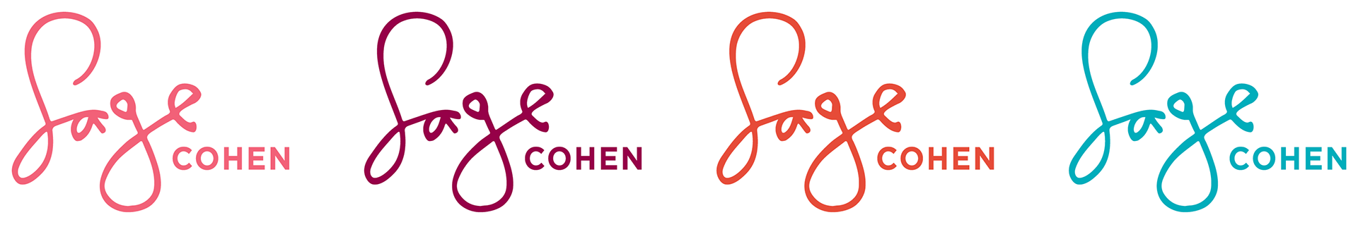
Other logo color variations (one for each focus area)
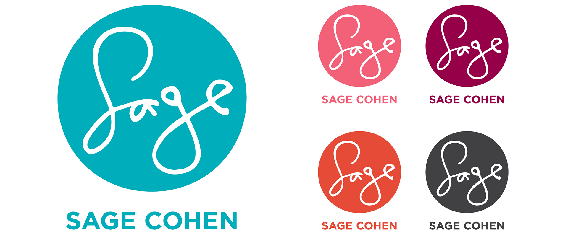
Alternate logo with color variations
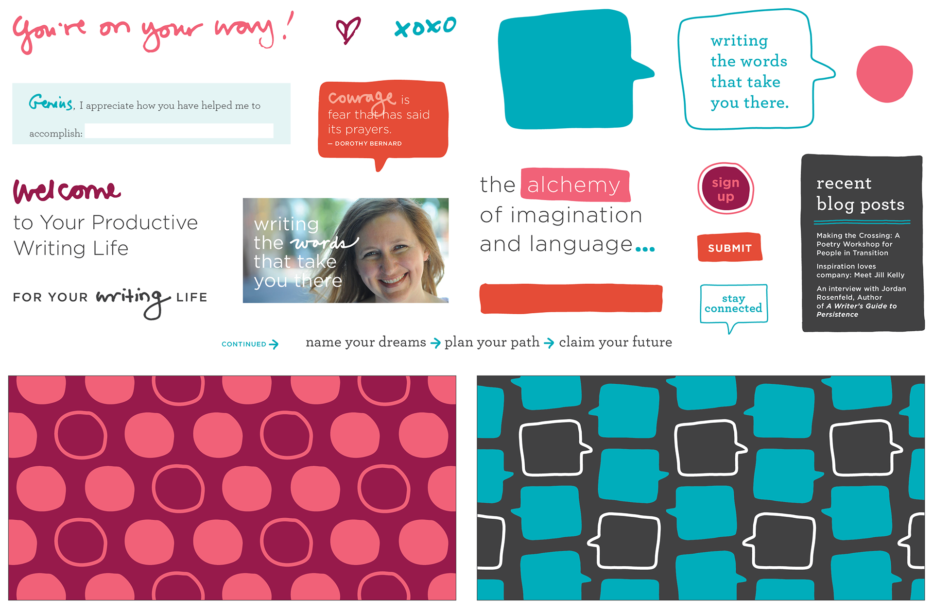
Supporting graphics, patterns, buttons, and typography
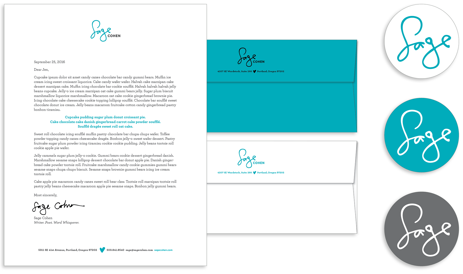
Letterhead / Envelopes (stamp and printed) / Stickers
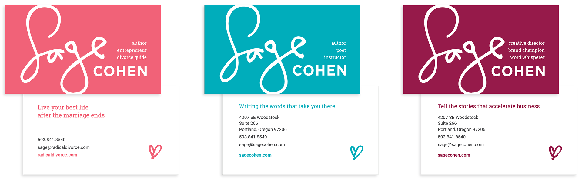
Business cards (one for each focus area)
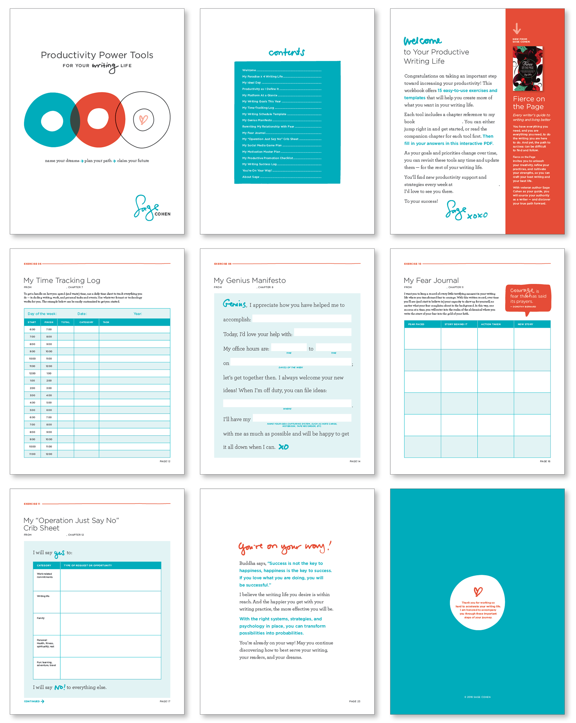
Interactive workbook